What is Vantage Charts?
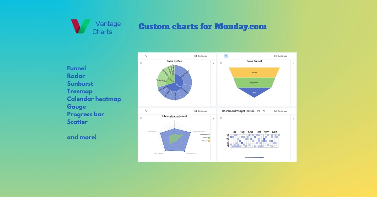
Vantage Charts is a privacy-first analytics app for monday.com that adds advanced chart types to boards, including Funnel, Radar, Tree Map, and Calendar Heatmap. It plugs into existing monday.com boards so teams can build interactive dashboards on top of their work data without exporting to a separate BI tool. The marketplace listing did not load during research, so claims here stay close to the public product description.
Why Vantage Charts works
Most monday.com customers run their roadmap, CRM, or ops boards in one place and then re-create the same data in spreadsheets to chart it. Vantage Charts removes that duplication by rendering the visualizations directly inside monday.com, which keeps the underlying data inside the workspace and gives operators a faster path from board to dashboard.
Vantage Charts features
- Advanced chart library. Funnel, Radar, Tree Map, and Calendar Heatmap chart types extend monday.com beyond its built-in bar and pie views.
- In-platform data flow. Per the description data stays inside monday.com rather than being shipped to external BI servers, which matters for privacy-conscious teams.
- Customization controls. Colors, categories, and layouts are configurable so each chart matches the way a specific team labels its work.
- Real-time updates. Dashboards reflect changes on the boards they pull from, so a sales or ops lead sees current numbers without manual refresh.
Who Vantage Charts is for
- Revenue ops leads running pipelines in monday.com who want funnel and conversion charts on the same board their reps already use.
- Project managers running multi-team programs who need radar or tree map views of progress across initiatives.
- Customer success teams tracking renewals and health scores who want calendar heatmaps over their existing monday data.
- Privacy-sensitive organizations that prefer dashboards rendered inside monday.com over sending board data to a third-party BI tool.
Similar micro SaaS ideas you can build
- Marketplace chart pack for ClickUp. App for ClickUp users that adds specialized visualizations like cohort heatmaps and funnels directly on existing lists, sold per workspace through the ClickUp marketplace.
- Notion database dashboards. Embeddable widget for Notion teams that turns a database into a live funnel or burn-down view without exporting, priced per workspace.
- Airtable executive dashboard. Tool for ops leaders running Airtable that produces a weekly read-only dashboard view with KPI summaries for execs, billed per published dashboard.